Colours have the incredible power to transform your mood, influence emotions, and set the tone of any space. When designing your dream home, understanding the principles of colour psychology can help you create interiors that are not only beautiful but also harmonious and functional. At NK Architects, we believe that every colour tells a story. Let’s dive into how you can use colour psychology to craft the perfect ambiance for your home.
1. Understanding the Basics of Colour Psychology
Colours can evoke specific emotions and influence how we perceive a space. Here are the fundamental colour groups and their psychological effects:
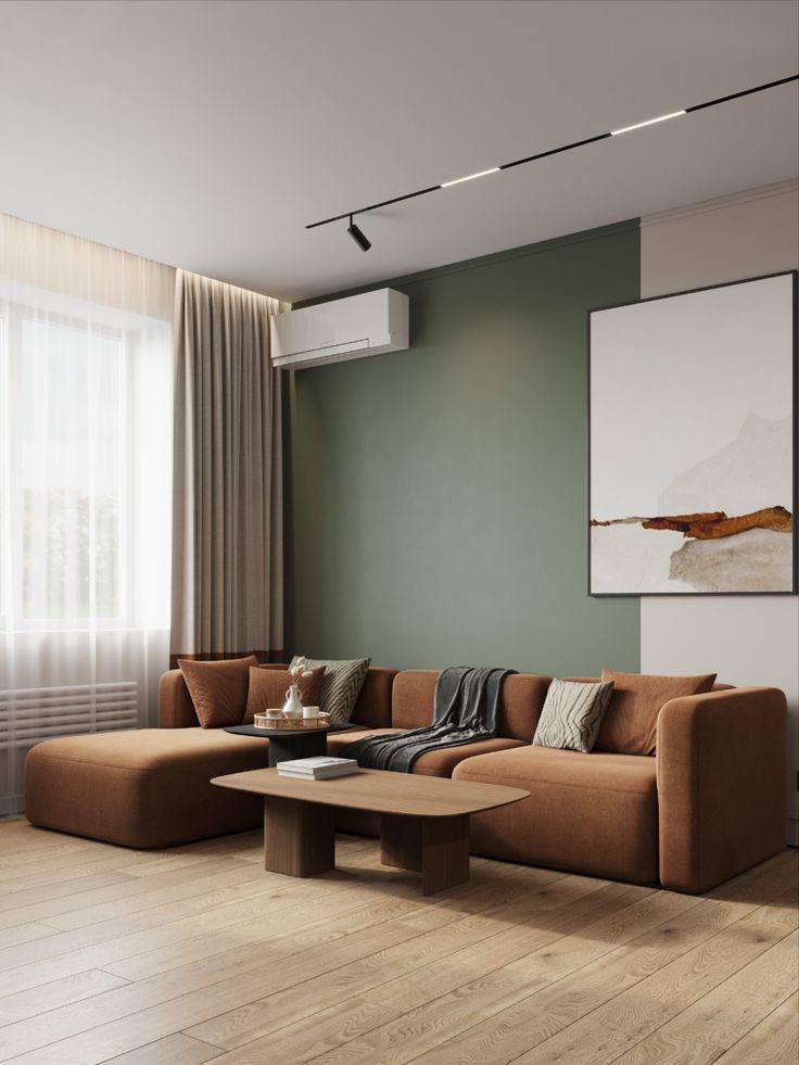
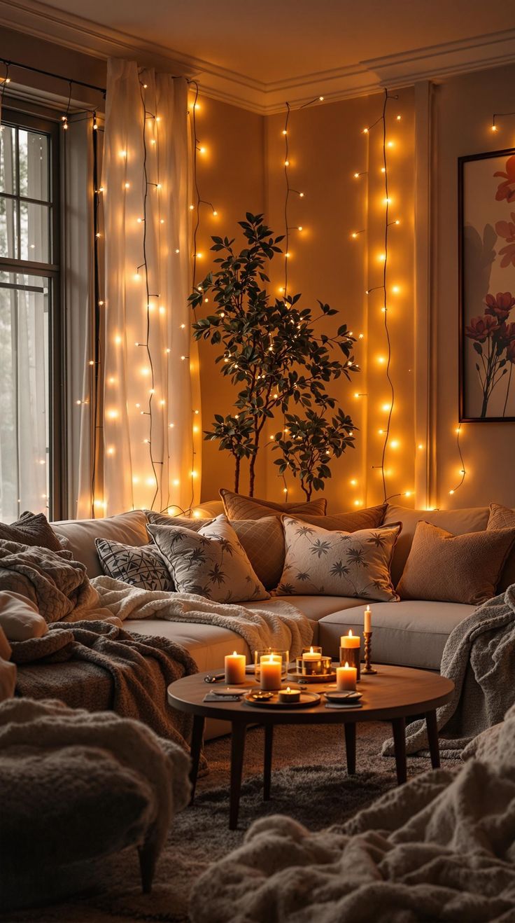
- Warm Colours (Red, Orange, Yellow): These hues exude energy, warmth, and passion. They’re perfect for spaces that encourage activity and socialization, such as living rooms or dining areas.
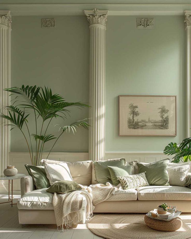
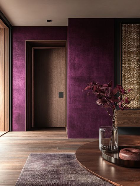
- Cool Colours (Blue, Green, Purple): These tones create a sense of calm, relaxation, and focus, making them ideal for bedrooms, bathrooms, and home offices.
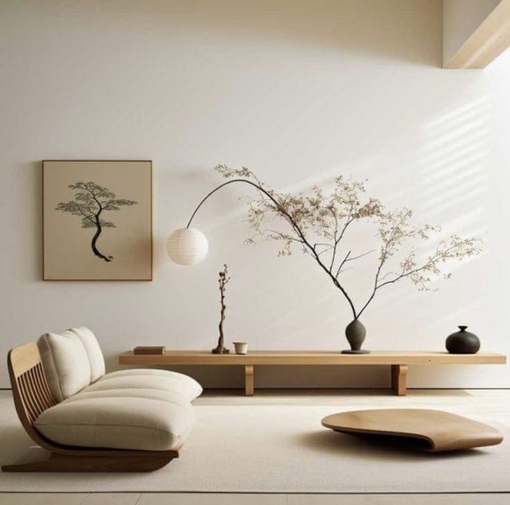
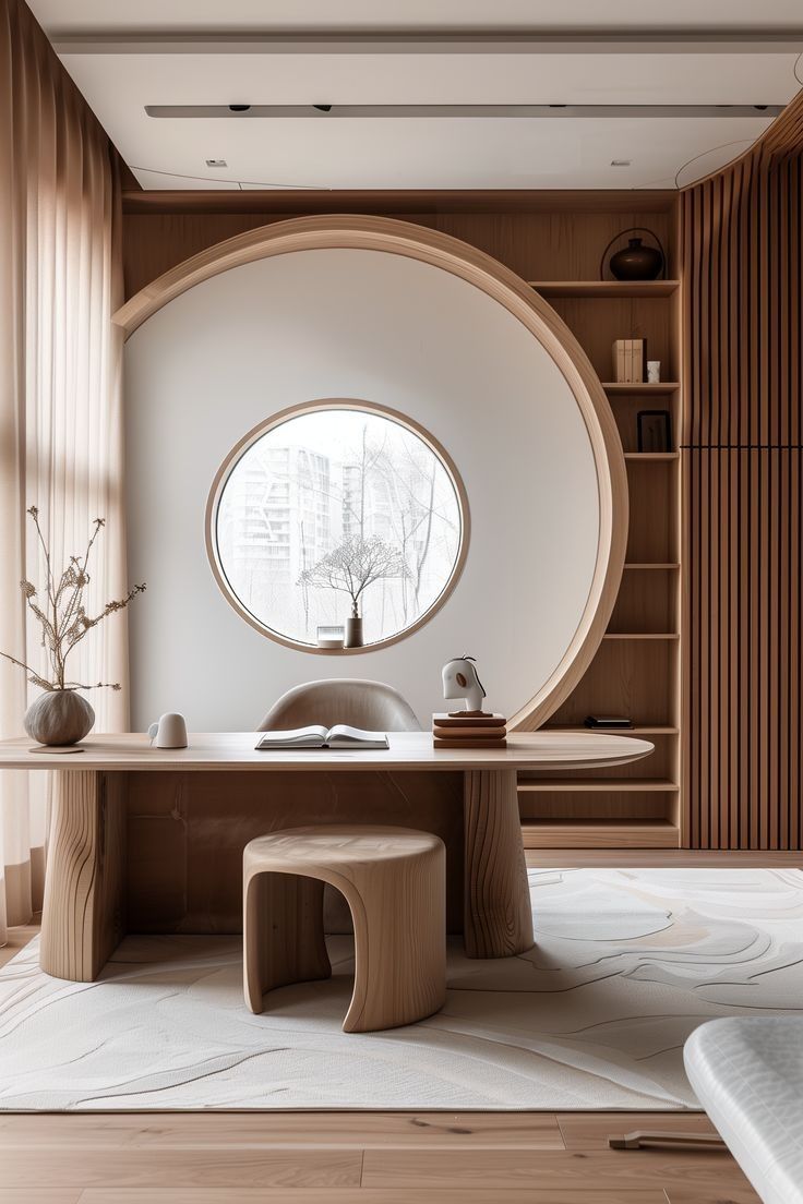
- Neutral Colours (White, Beige, Grey): Neutral shades provide balance and flexibility, serving as a foundation for layering accents.
Pro Tip: Start with a neutral base and incorporate bold colours through furniture, art, or accessories to add personality without overwhelming the space.
2. Choosing Colours for Different Rooms
Every room in your home serves a unique purpose, and your colour choices should align with the intended mood and functionality of the space.
Living Room:
- Best Colours: Soft neutrals, warm yellows, and earthy greens.
- Why: These shades promote comfort and conversation, making the room inviting for guests and family.
Bedroom:
- Best Colours: Cool blues, muted purples, and pastel pinks.
- Why: These calming tones help create a serene environment conducive to relaxation and sleep.
Kitchen:
- Best Colours: Bright whites, sunny yellows, and vibrant reds.
- Why: These colours boost energy and stimulate appetite, adding a sense of vitality to the heart of your home.
Home Office:
- Best Colours: Light greens, soft blues, and neutral greys.
- Why: These shades enhance focus, productivity, and a sense of calm during work hours.
3. Using Accent Colours Strategically
Accent colours can add depth and character to your interiors when used correctly.
Tips for Incorporating Accents:
- Use bold hues sparingly on smaller elements like throw pillows, rugs, or artwork.
- Create contrast by pairing complementary colours, such as navy and gold or teal and coral.
- Use accent walls to make a statement without committing to an entirely bold room.
Pro Tip: Choose one or two accent colours to maintain harmony and avoid a cluttered look.
4. The Impact of Natural and Artificial Light
Lighting dramatically influences how colours appear in your home.
- Natural Light: Colours look brighter and more vibrant under natural daylight. Consider this when choosing hues for spaces with large windows.
- Artificial Light: Warm-toned lights can enhance yellows and reds, while cool-toned lights amplify blues and greens. Test Before committing, paint samples under various lighting situations.
Pro Tip: Opt for adjustable lighting solutions to alter the mood of a room throughout the day.
5. Colour Trends and Personalization
While staying updated with colour trends can inspire your design, personal preferences should take precedence. Popular colour palettes for 2025 include:
- Soft Earth Tones: Warm browns, terracotta, and muted greens for a natural, grounding feel.
- Bold Jewel Tones: Rich emeralds, sapphires, and amethysts for a touch of luxury.
- Minimalist Neutrals: Shades of beige, off-white, and greige for timeless elegance.
Pro Tip: Blend trends with timeless shades to ensure your space feels fresh yet enduring.
Why NK Architects is Your Go-To Design Partner
At NK Architects, we specialize in crafting spaces that reflect your personality while optimizing functionality. Whether you want to create a calming retreat or an energizing workspace, our expertise in colour psychology ensures your home will be as beautiful as it is purposeful.
Contact us here for personalized solutions follow us on Instagram for more tips on creating luxurious, harmonious spaces!